top of page
Indawee Pandit - Portfolio 2024

what is a
Biskutt? Although it is a flour-based baked and shaped food item, for most people, for me, it's the name of my internship project at Differ Draft Design. It gave me a great opportunity since I got to lead and art direct a project by myself, despite still being an intern. I got to communicate, collaborate and connect with different people. It led to this collaborative journal called "Biskutt", I had the creative freedom to ideate and explore, across the various stages of design development. I handled conceptualisation, design, art direction, typography, content writing, illustrations, print sampling, animation, video editing and a social media stratergy.

why is a
Have a
Biskutt? It's the result of like-minded people coming together and celebrating the older, simpler times, ordinary, everyday things, and subjects of lesser importance in the fast-paced modern times. It has perspectives of different people and how their art. I connected and synchronised these narratives visually and conceptually and put them together in a journal-like format.
Social media
I designed, illustrated and curated these assets for various print and digital platforms.


![IMG_1864[1]_edited.jpg](https://static.wixstatic.com/media/e7405f_63898ed8770d402aa2aaec155745a4ae~mv2.jpg/v1/fill/w_490,h_367,al_c,q_80,usm_0.66_1.00_0.01,enc_avif,quality_auto/IMG_1864%5B1%5D_edited.jpg)


.png)


logotype
Hindi | english| urdu
The bold, sketchy, handmade, curvy logotypes were inspired by one of my earliest memories of Biskutts. They are a little distant, nostalgic memories. It's particularly associated with Sunday afternoons when I would go grocery shopping with my grandma. I would wait patiently for her as she would finish her shopping and as a reward for being patient, she would buy me a few handmade Biskutts neatly stacked in a humongous jar.


TYPEFACE
I developed this custom typeface for Biskutt, to be used as an asset across various collaterals.


layout
I created several layouts for the inside of the journal and settled on a minimal, simple and functional option, with an incorporated "D" from "Differ Draft Design" as an outline.


packaging
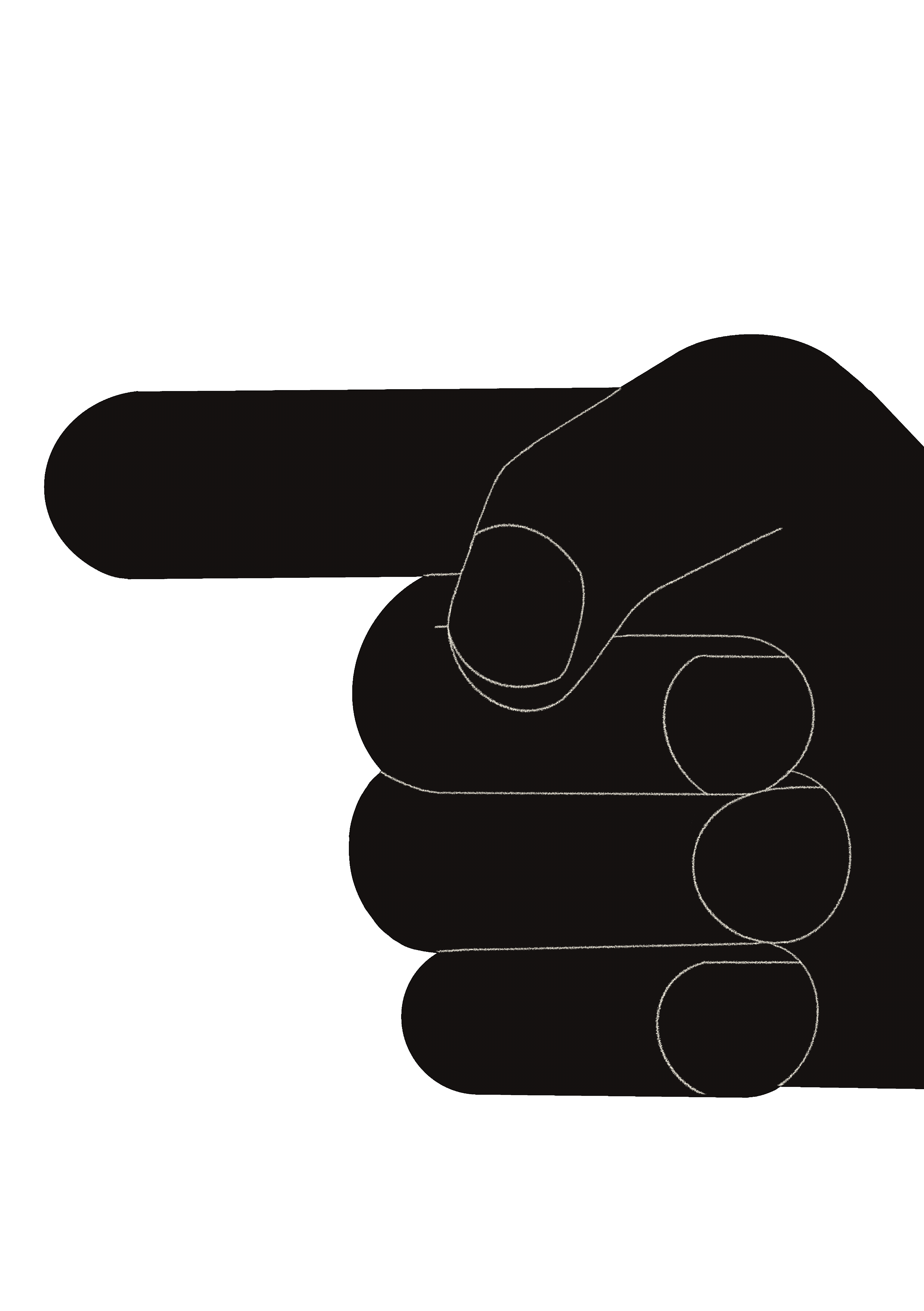
I designed options for various packaging materials, with different illustrated assets. The final wrapping paper had a few illustrated hands holding biskutts together, to show that "Biskutt" is for everyone who reaches out, dares to be different, unique.


Packaged Independence

I designed several conceptual artworks for "Biskutt" Packaged Independence as one of the artworks. I found out that understanding the meaning of independence was a complicated process due to its multidimensional nature. The irony is that the concept of "Independence" itself comes with many attachments such as - disconnection from the world, consequences of one's actions and clarity of one's thoughts. To express my understanding of the same, I created a packaging design for it.
I associated numerous everyday chores with my independence closely and felt like they went hand in hand with my idea of it, rather than a heap of tasks.
elements
Clock - waking up
Money - Managing Expenses


Bucket - cleaning
broom - cleaning
Washing Machine - Apparels
Beer - Recreational
Gas - cooking
Laptop -working

THE emergency page

The break glass sign on buses and trains inspired this artwork. One day, while looking at one of these signs I realised that these signs could also inspire the concept of a notebook. I have never owned a notebook without having a page or two ripped out because of some paper-related emergency. So I thought of designing a designated page for tearing, as a problem-solving technique.


I sincerely extend my gratitude to the team of Differ Draft Design for their creative inputs & collaborative spirit of bringing a project to life.

Biskutt
Differ Draft Design
Thankyou
धन्यवाद

bottom of page